Tables are the basis for displaying structured data in web applications. Adding features like scrollable headers and frozen (sticky) columns can make tables more user-friendly. In this article, we’ll explore how to build a table with sticky headers and frozen left columns using pure HTML and CSS.
CodePen example
To see the code in action, check out this live example on CodePen:
This code example uses JS classes to create a table. You can replicate this using any framework or library of your choice.
Main features of the table
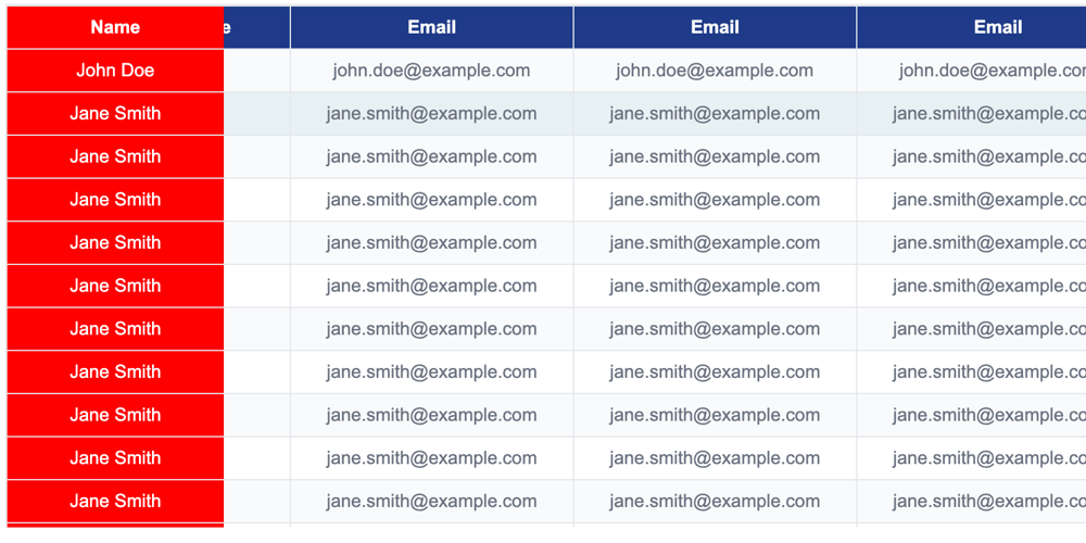
- Sticky title: Table title remains visible at the top when scrolling vertically.
- Freeze left column: The first column remains fixed when scrolling horizontally.
- Scrollable content: supports vertical and horizontal scrolling.
- CUSTOMIZABLE STYLE: The table design is clean and modern, with zebra stripes and a hover effect.
HTML structure
We use a simple table structure
for the rows. The table is wrapped in a div For scrollability. Here is the code:
class="table-container">
class="table">
Name
Age
Email
John Doe
25
john.doe@example.com
Jane Smith
30
jane.smith@example.com
CSS for sticky headers and frozen columns
Here's the CSS that makes the magic happen:
/* General styles */
body {
font-family: Arial, sans-serif;
}
/* Scrollable container */
.table-container {
border: 1px solid #e5e7eb;
border-bottom: none;
overflow: auto; /* Enables both horizontal and vertical scrolling */
height: 400px; /* Limits table height for vertical scrolling */
}
/* Table layout */
.table {
border-collapse: collapse;
width: 100%;
table-layout: fixed; /* Ensures consistent column widths */
}
/* Table cells and headers */
.table th,
.table td {
padding: 8px;
text-align: center;
border: 1px solid #e5e7eb;
}
/* Frozen first column */
.table td:nth-child(1),
.table th:nth-child(1) {
background: red; /* Highlighted background for frozen column */
position: sticky;
left: 0; /* Ensures the column stays on the left */
z-index: 5; /* Keeps the column above other cells */
color: white;
}
/* Add higher z-index for header */
.table th:nth-child(1) {
z-index: 6;
}
/* Sticky header */
.table th {
background-color: #1e3a8a;
color: white;
font-size: 14px;
font-weight: bold;
position: sticky;
top: 0; /* Makes the header stick to the top */
z-index: 2; /* Keeps the header above the table body */
}
/* Styling for table body */
.table td {
font-size: 14px;
color: #6b7280;
}
/* Zebra striping for rows */
.table tr:nth-child(odd) {
background-color: #f9fafb;
}
/* Hover effect for rows */
.table tr:hover {
background-color: rgba(14, 116, 144, 0.1);
}
/* No data row styling */
.no-data {
text-align: center;
font-size: 14px;
color: #9ca3af;
}
Explain CSS
Scrollable container:
Added Overflow: auto to the .table-container class to enable horizontal and vertical scrolling. The height: 400px attribute limits the height of the table to ensure vertical scrolling of larger datasets.
Sticky title:
this position: sticky and top: 0 properties apply to
elements to ensure the header remains visible during vertical scrolling.
z-index: 2 ensures the header is displayed above the table body.
Frozen Left Column:
The first column is styled using nth-child(1) selector
and
.
The position: sticky and left: 0 Property ensures that columns stay in place when scrolling horizontally.
The z index value distinguishes the column's cells (5) and headings (6) to ensure proper layering.
Highlight frozen columns:
The background color of the frozen column is set to red and white text is used for better visibility. You can customize it to match your design preferences.
how it works together
The position: sticky header remains on top of the .table-container when you scroll vertically.
When scrolling horizontally, the leftmost column remains fixed, creating a frozen column effect.
The combination of Overflow: Automatic and Position: Sticky ensures that the workbench remains functional and user-friendly in both axes.
Enhancements you can add
Responsive adjustments:
Use media queries to adjust column widths and table layout for smaller screens.
Dynamic content loading:
Use JavaScript to dynamically retrieve and populate rows of larger datasets.
Interactive features:
Use JavaScript to add row click events, filter or sort to enhance functionality.
final thoughts
Use standards
element and a few lines of CSS, we’ve created a powerful, responsive table with a sticky header and a frozen left column. This approach is lightweight, easy to implement, and works seamlessly across modern browsers.
Whether you're building dashboards, displaying reports, or handling large datasets, this method ensures a clean and professional design that’s also user-friendly. Try it out and let me know how it works for your project! 😊
Read next
Day 21: In the name of Progress! 📈
Valeria -
Custom YouTube Player Gadget with Javascript
Anwar Achilles -
FlexPlyr: 模組化多風格播放器
邱敬幃 Pardn Chiu -
Things About Nonce & CSRF Token: Differences, Use Cases, and How They Work
Fin Chen -